All of us, as car people, tend to have opinions set in marble about things that are very dumb. Some of us care very much if a Porsche 944 has the correct windshield seal (because it is often the wrong one). Me? I have a major, incurable desire to have in-period navigation in my cars. And my favorites are the no-name stuff that Lexus, Honda, and Subaru used in the 2000s.
I say no-name because I can’t accurately track down who made their actual navigation software. We contacted Panasonic, the most likely suspect for this navigation system and they responded with “Panasonic supplies infotainment systems to various car manufacturers such as Honda, Toyota Lexus, Subaru, etc. But, since these OEM products are products of the car manufacturer, please contact the car manufacturer for inquiries about their specific systems.”
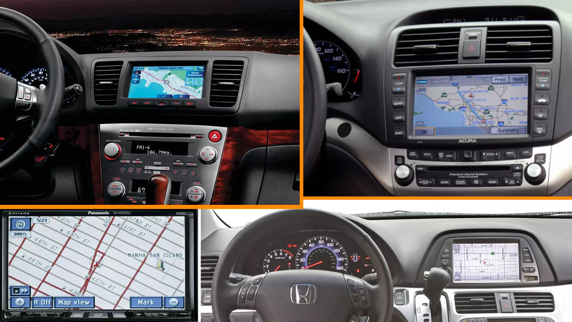
It gets weirder; these same maps are all loaded on navigation computers from different hardware makers. Subaru used Kenwood for navigation in the fourth-generation Legacy, Lexus used Denso for the IS300, and Honda used Matsushita Electric for the Odyssey and Acura for the TSX and TL. Though the makers of the hardware differ, I swear those maps look the same if I put them side by side, especially the IS300 and the Legacy.
For years I believed it to be a licensed Panasonic, but I can’t find anything concrete to corroborate that, nor does Panasonic want to own it. I contacted the automakers to find out. Subaru confirms what I said about Kenwood: “Our supplier the physical unit and for the map disc, at that time, was Kenwood.” Honda outright doesn’t “provide third-party supplier information” so there was no luck there. Lexus has yet to get back to us with our admittedly bizarre request.
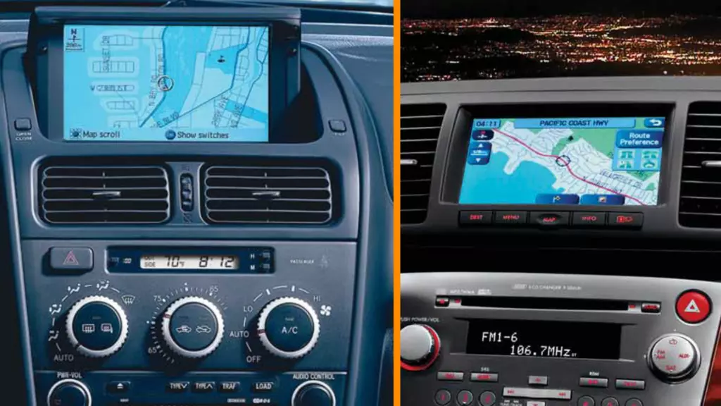
I’ll be damned if those map screens don’t look like they are the same. Sure, the UI style is a bit different, but clearly, some company could have made these systems and sold them en masse. Though I can’t fully solve the mystery of who made this system, Panasonic remains high on my list. I have my reasons, primarily this bit of photo evidence from the early aughts.
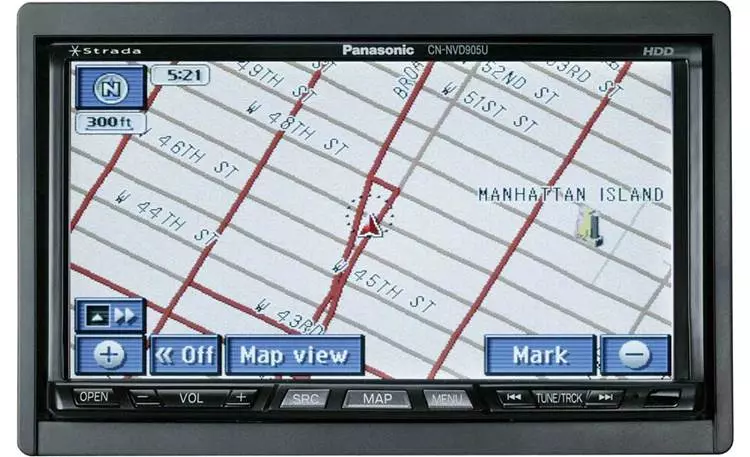
I’ve stared at that font and map style for a cumulative two years in my former 2008 Subaru Legacy Spec.B and my friend’s Lexus IS300 SportCross. That is the exact one on this Panasonic Strada CN-NVD905U. Of course, small UX stuff has been changed like the buttons and icons, but the map style, font, awkward spacing of letters and simplicity of it are too familiar to ignore. Panasonic did say something interesting about my find with this Strada unit.
“Panasonic developed both the software and hardware for Strada, so there is no licensed supply with competitors such as Kenwood or Alpine. However, content such as a map database or POI (Point of Interest) database [is] supplied by a supplier. So, there is the possibility that our supplier could supply the same data to a competitor.” It sounds like the map database is not Panasonic’s product. I contacted them for further comment and will get back with any new info.
Anyways, for whoever the hell made this system, I think this could be a solid contender for the best navigation system of all time. Let me look past my nostalgia and love for the 2000s era of Japanese cars and my borderline obsession with mapping stuff and evaluate the system for what it is. It’s simple, easyish to use, very legible when on the road, and information is loudly and clearly communicated to you, the driver. If we updated these old systems with the road data of today, I’m sure it would still calculate a pretty decent route for you. It won’t be the quickest or the slickest, but it was intensely reliable throughout my multiple-ownership of the system across several brands of car.
My Subaru used to give me three options on long trips that were all reasonably viable and none of them would get you lost. Inputting the address is a total shitshow like most systems, even modern, but once it’s in, set and forget.
Having used much of the 2010s and even some 2020s car navigation systems, I think this old Panasonic stuff was the start of a plateau of usability. It has a touch screen so it isn’t totally foreign to use in the modern context, and because it isn’t cluttered full of random locations like modern nav stuff, it’s kinder to the eyes and less distracting.
If there were a reality where we used this system until Apple CarPlay was invented, I think we would still have Honda Civics with 8,000 rpm redlines and BMW would have never made the front-wheel drive-based 2 Series Gran Coupe. OK, I’m exaggerating. But I’ll forever be effusive in my praise of 2000s navigation systems. New car stuff is pretty to look at, but is it any more useful? I think not. Google Maps is.
The only infraction I can hand Panasonic for this gear is not having a 3D perspective like the next generation of in-car navigation. The later Continental Volkswagen navigation in my GTI ticks that box admirably, but it does not stir my soul-deep desire for simplicity like the (probable) Panasonic.
This might sound like complete lunacy but I’m sure someone shares my feelings. I think aftermarket head units and CarPlay look out of place on older cars and I’m fond of the design sensibilities of that era going along with the technology that existed. Tell me what era is your favorite in the comments and roast me for declaring what I had in my 2000s Subaru to be the GOAT.
More great stories on Car Autance
- The auto plant riots in Squid Game were fictional, like the rest of the show, but closely based on very real and very serious events.
- Take a closer look at how refined a Tesla Model 3 really is.
- Find out why police can claim they have “certified” speedometers while most other cars can’t.
- You’re probably familiar with the BMW E46 M3, it’s amazing, but there were a few aftermarket M3 alternatives from that era that are also worth learning about.
- Read our Review Rundown of the new Toyota Tundra to get a big range of perspectives on the new truck in one place.
